El Diablo

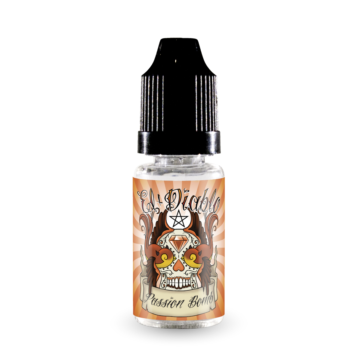
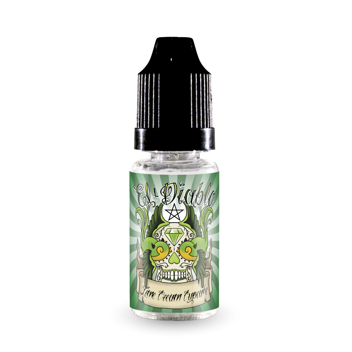

Recently I have had the pleasure of designing the new range of labels for El Diablo Juices. El Diablo are a great new startup with some amazing liquids, they were even kind enough to send me some up to try, and I must say they are decadent! The label I’m featuring here, “Beelzebub” is my favourite so far out of the current range of four. They are looking to expand the flavours in 2015, an I for one am excited!
You can sample their liquids for yourself at www.ElDiabloJuices.co.uk
Or you can chat to them on Twitter here, or on Facebook here.
El Diablo Label Design Case Study
-
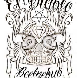
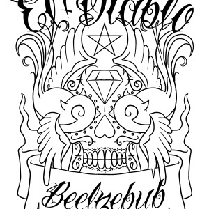
- Pencil Sketch
-
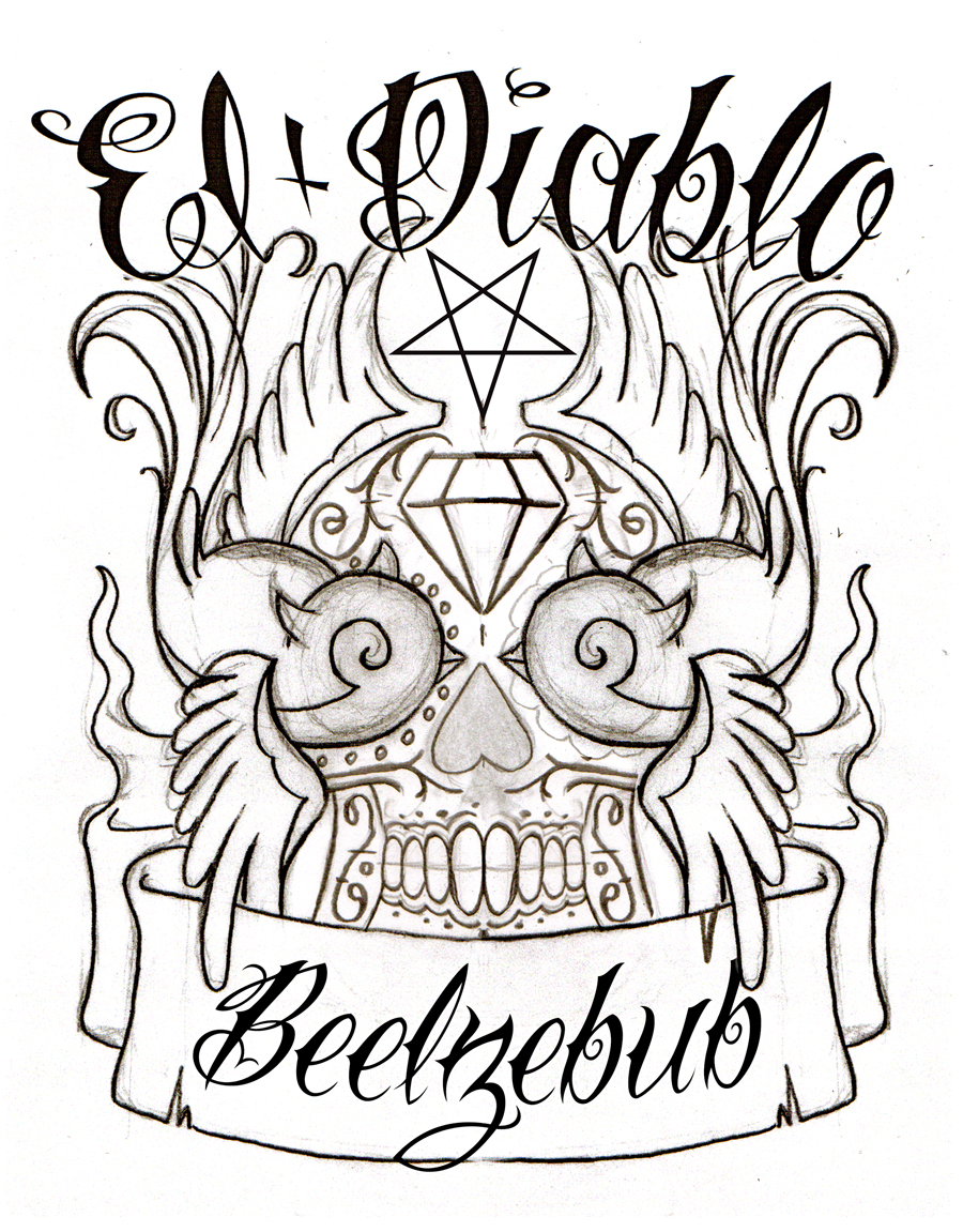
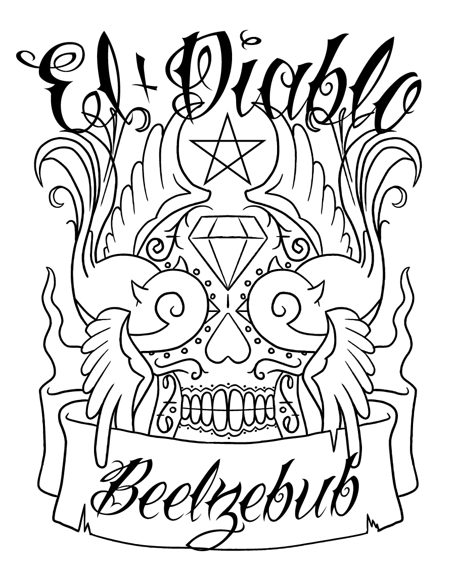
- Digitised Outline
-
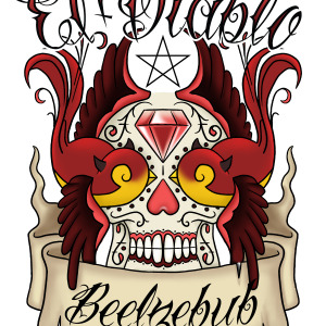
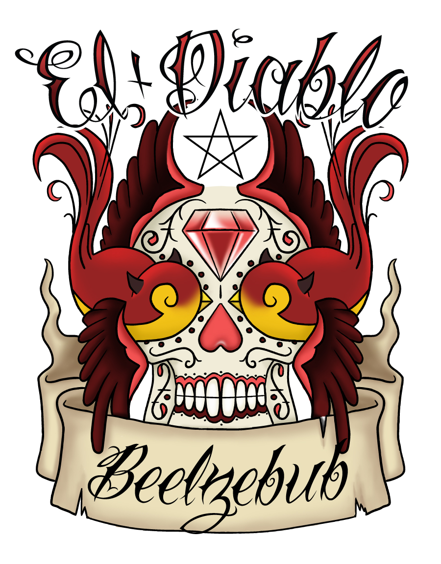
- Full Colour
The drawing progression above shows the workflow of how these labels came to be, let’s have a look at a break-down of the design process:
STEP ONE
Starting with a series of pencil sketches using the clients input, we created a design that features both masculine and feminine features. To some the label is of two swallows kissing… to others its a mexican sugar skull.
STEP TWO
Once the sketches are signed off and finalised, the next stage is digital ‘inking’, using a graphics tablet all the lines are drawn in to perfection. Using the same graphics tablet and a little more software the colours are painted in to give the final illustration. This particular design features the solid black lines many would attribute to a ‘cartoon/animation’ style, many of my designs feature this as it allows the small labels to be very bold in imagery and stand out in the crowd.
STEP THREE
Now the artwork needs scaling to the label size, in most cases designs can be fit to an existing cutter the label printers have which helps reduce the cost to the client. Once scaled the background is filled in with colours and textures to complement the illustration. At this stage flavour variants are also overlaid if applicable.
STEP FOUR
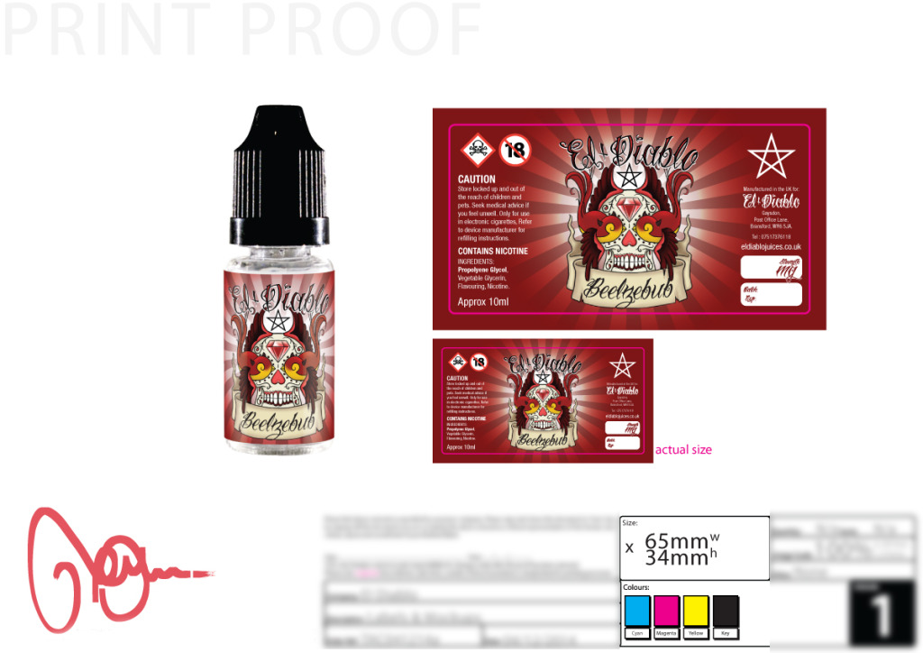
Now the label is looking awesome… but that’s not quite enough, we need to make them legal. This means Globally Harmonised System/CLP (formerly CHIP) pictograms and phrases inline with the chemical constituents contained within the liquid. The labels also require address, company details and an ingredients list – and a few more bits and bobs to make them compliant to sell in the UK & European Union. Now the artwork is finished, on to the last step…
STEP FIVE
As standard I supply a ‘mockup’ image of the label on a bottle, I find this can be very useful as a label can look very different when on the actual product. Also this means the client can get advertising or setting up their online shop, without having to wait for the printed labels to arrive, always a bonus. The next step is to send though a print proof (see below) for the client to sign off, or to make any amendments. Once all signed off, the artwork is forwarded to the printers and the new labels will be on their way. These 5 steps make sure not only the labels are perfect, but the client has everything they need in order to succeed, this is the professional standard I provide to each and every client, regardless of size or budget.
Every client is provided with master artwork files, mockups, logo files and even a logo based profile picture for social media. I make sure each and every client looks as good to the outside world as well as their juices taste.